This infographic from FrugalDad.com sheds light on the immense amount of money and imported good accumulated by Walmart. It’s crazy that the CEO makes more per-an-hour than its sales associated make in a year!

trek through anything and everything design
This infographic from FrugalDad.com sheds light on the immense amount of money and imported good accumulated by Walmart. It’s crazy that the CEO makes more per-an-hour than its sales associated make in a year!

Posted in Design
By: Mathilde Solanet
Super cute student packaging for a hypothetical dog grooming company. I’m not sure what the toys have to do with dog grooming, maybe the company was branching out to sell a more variety of product. However, the packaging was just too clever and cute to not showcase.
The logo looks abstract at first, but on closer examination it’s a dog made of grooming scissors for the eyes. The packaging cleverly uses the action of a dog holding a toy in its mouth to show the function of the product. Well done.
I found this great design idea on The Design File. The campaign was done by Suzy Tuxen at A Friend of Mine, a design agency based in Melbourne. This wonderful hand cut paper design was executed for VCE Season of Excellence, a series of events and exhibitions celebrating a selection of A+ grade work produced by VCE students in an array of creative fields. The paper design was translated into a brochure as well as environmental signage. More pictures of the work can be viewed on the A Friend of Mine website.
I would love to find a way to use the idea of cut paper for one of my designs. Maybe my new portfolio site?
Posted in Design, Packaging, Potfolio Enhancement
I’m redesigning a poster that I did for the movie JAWS. I am going to simplify the design by taking out needless information. I will also make the concept more dark and intense.
This is the most recent version of the redesigned poster i’ve created. I made the JAWS much more subtle and switched the format to horizontal. This puts more mystery in what is below the edge of the poster. I reworked the information to fit in the corner of the poster in bright “blood” red with a fade that hints at the depth of the ocean.
Posted in Design, Potfolio Enhancement
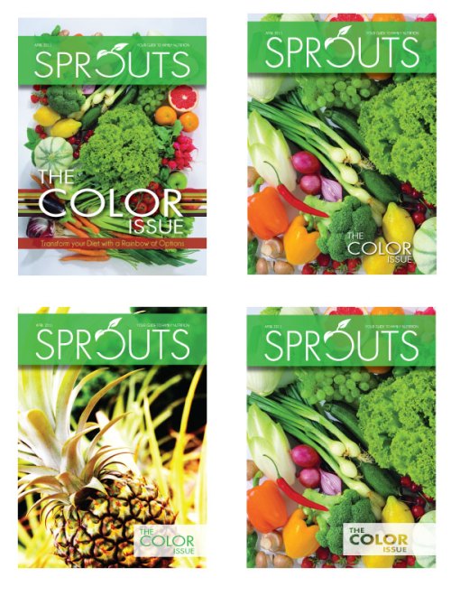
I researched some new photos for the cover. In these four versions you can see two of the new photo choices. I ultimately decided to go with the one with all veggies rather than the pineapple because I didn’t want to change the “Color” theme of the magazine. After choosing the photo, I played with a zoomed in and cropped version.
In the top left version, “The Color Issue” is still competing too heavily with the masthead and the tagline is unnecessary. The masthead still needs to be tweaked as well.
In the other three versions, the masthead has been fixed and I played with ways the put “The Color Issue.” I favored an asymmetrical arrangement.
SOME THINGS THAT STILL NEED WORK:
The masthead drop shadow appears very intense with the new cleaner photo. The zoomed out photo from the first version looks the cleanest and is preferred by most who viewed the different versions. I will play with changing the color of the masthead.
There have been a lot of improvement in the second rework. Changing the masthead color is working better than the original green I had. The smaller “The Color Issue” is not competing with the masthead anymore.
I am still working on small details about the colored stripes behind “The Color Issue” and I am not sure which color to use for the masthead.
Posted in Design, Potfolio Enhancement
SPROUTS is a publication focused on family nutrition. The magazine features family friendly recipes, activities, and healthy eating advice. Each issue focuses on a special subject. The issue below is focusing on adding more color to your families daily diet (thus “The Color Issue”).
I am going to start working on redesigned all aspects of the magazine design. I will first tackle the cover and then move on to the contents page and main story spreads.
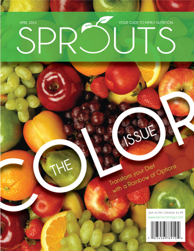
The cover needs some work and since it is the first impression for the consumer viewing it on the shelf it is the logical place to start my redesign. I am going to explore better images, possibly with a cleaner appearance. The masthead needs to be tweaked. The font should be re-examined and the “O” should be a perfect circle. The “O” should also be the same width as the rest of the letters. I will take the bar code off and re-address the text arrangement. It is far to large and the angle is conflicting with the masthead.

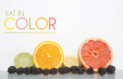
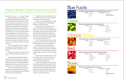
The opening of the inside spread is working great and may not need much tweaking at all, however, the rest of the story is hideous. I’ll probably scrap this layout and start from scratch.
Posted in Design, Potfolio Enhancement
I made some special business cards for Daniel Whitton at DFW Carpentry for building the box that I will use for my final packaging assignment. I went with a non-traditional material and size for his cards. Since the business cards are for a carpenter I decided to make them out of wood and laser engrave the information into them. I also made them 2″x4″ rather than the normal 2.5″x3.5″ size to reference the use of 2-by-4s.
I hope he likes them!
The redesigned poster features a horizontal format that is better for incorporating “The Musical Gift Revolution.” In the new campaign “”HMV” is integrated into the ads on the musicians clothing. The musician had been simplified and tweaked to have a consistent look across all campaign materials.
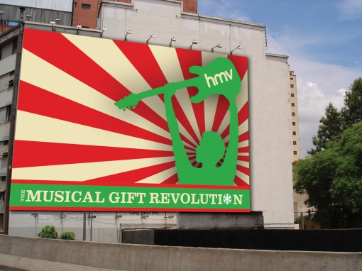
The redesigned billboard, much like the poster has a simplified version of the musician. The two-tone effect has been replaced by a one color version of the musician. There is a very strong relationship between the billboard and poster now.
Posted in Design, Potfolio Enhancement