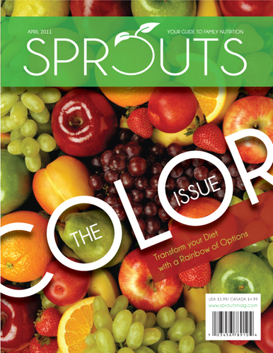
SPROUTS is a publication focused on family nutrition. The magazine features family friendly recipes, activities, and healthy eating advice. Each issue focuses on a special subject. The issue below is focusing on adding more color to your families daily diet (thus “The Color Issue”).
I am going to start working on redesigned all aspects of the magazine design. I will first tackle the cover and then move on to the contents page and main story spreads.

The cover needs some work and since it is the first impression for the consumer viewing it on the shelf it is the logical place to start my redesign. I am going to explore better images, possibly with a cleaner appearance. The masthead needs to be tweaked. The font should be re-examined and the “O” should be a perfect circle. The “O” should also be the same width as the rest of the letters. I will take the bar code off and re-address the text arrangement. It is far to large and the angle is conflicting with the masthead.


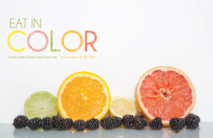
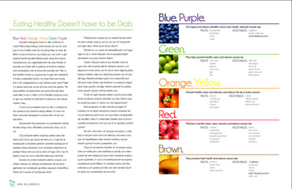
The opening of the inside spread is working great and may not need much tweaking at all, however, the rest of the story is hideous. I’ll probably scrap this layout and start from scratch.